

Critique: Figure Ground - I have a problem with this, and that is that the lowest percentage countries are hard to see because the ground is white, and the countries are a very light color, making them harder to see.
Legibility - No problems with legibility.
Clarity - As I mentioned above, it is hard to see the countries with very low percentage.
Balance - Balance is good.
Visual Hierarchy - It would be nice to have a scale, but not necessary. Not a
OVERALL - 9/10

Critique: Figure Ground - If they didn't include parts of Canada, the figure ground would be better. It makes distinguishing what is important and not important harder to see.
Legibility - Hard to read the scale on the bottom of the map, because of the chart.
Clarity - Can't read the scale, hard to read some of the labels
Balance - Balance is fine
Visual Hierarchy - They included a scale, Title, producer, information..., if the scale were visible, it would be better. And if they got rid of some of the Google Earth things, ie., the zoom in/out bar.
OVERALL - 5/10

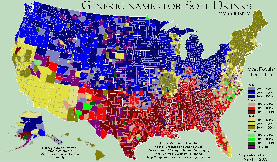
Critique: Figure Ground - The figure ground is good, there is a clear distinction of what is important, and what isn't.
Legibility - The legibility is ok. Some areas are a little harder to see because of borders.
Clarity - There is only one problem with clarity, and that is that the 30-50% that call it soda and the 50-80% that call it soda. The color is very similar, and it is hard, for me at least, to see a difference.
Balance - The balance is good. The map is in the center, the title is at the top, they include a legend. The only problem I find with this map is that they don't include a scale, because Alaska and Hawaii are not at the same scale. I feel like the map is set up very well, the objects are set up in logical places.
Visual Hierarchy - A scale would be nice, because they include Hawaii and Alaska. Other than that, it looks good.
OVERALL - 8/10

Critique: Figure Ground - There is a difference between the figure and the ground.
Legibility - Hard to tell some of the schools because they are too small.
Clarity - The map itself has weird looking shapes for states. Hawaii looks like a solid piece of land, when in reality it is many islands. The map is just simplified.
Balance - Some logos are bigger than others, based on the size of their allegiance. It makes the smaller allegiances harder to read, but it shows the strength of bigger schools.
Visual hierarchy - There is no title, or scale, or Alaska. It would be better if they included them.
OVERALL - 6/10
The map is very generalized. Alaska is not included, but Hawaii is. The shapes of the states are very weird, too. The idea of this is pretty cool. Showing allegiances to college teams. It allows people to see which school they might support in a certain area of the state. Michigan and Florida are two great examples. They are divided amongst a few colleges, with 2 or 3 main universities covering most of the area.

Critique: Figure Ground - The important stuff is highlighted, and the not important stuff is not. Figure ground is good.
Legibility - Writing is legible. It is easy to read.
Clarity - Clarity is a little more difficult, because there are similar colors, and the color for no answer I asusme is a gray, which is also Iowa State.
Balance - Balance is ok, what they have is positioned well.
Visual Hierarchy - There is no title or scale, which would have been nice.
OVERALL - 8/10
I actually like this map. It is a map of men's college basketball, and who individual counties think will win the national championship. I like that they use individual counties, because it shows how states are undecided on which teams to support. Illinois, Texas, all of New England, the south, etc., we see that they are not sure which teams to support.
